A calm colour scheme can make your home feel more comfortable, welcoming, and restful. The right colours may help a room appear brighter, more spacious, or better suited to quiet activities such as reading and relaxing.
Choosing soothing colours does not mean every room must be white or pale blue. Soft greens, warm neutrals, gentle greys, muted earth tones, and dusty pastels can all create a peaceful atmosphere. The key is to consider how colours work together and how they respond to light in your home.
Start with the Feeling You Want
Before choosing paint or accessories, think about how you want the room to feel. A bedroom may benefit from colours that encourage rest, while a family room may need a calm but welcoming look.
Consider words that describe your ideal space, such as:
– Peaceful
– Warm
– Airy
– Cosy
– Natural
– Bright
– Relaxed
– Balanced
These words can guide your choices. For example, soft green and warm beige may suit a natural, relaxed room, while pale blue and light grey can create an airy, quiet feeling.
It also helps to consider how you use the space. A room designed for calm evenings may need softer, less stimulating colours than a busy entrance or creative workspace.
Explore Soft, Muted Colours
Calm colours usually have a gentle appearance rather than a strong, bright intensity. Muted colours contain a small amount of grey, white, brown, or another neutral tone. This softens their overall effect.
Some popular calm colour families include:
Soft greens
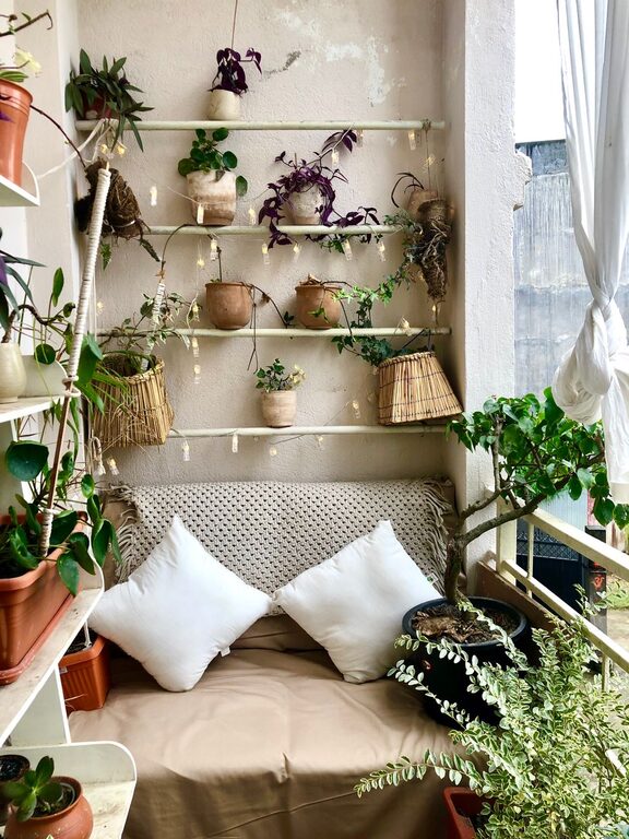
Muted sage, eucalyptus, and olive green can bring a natural feeling indoors. Green works especially well in living rooms, bedrooms, kitchens, and home offices. Pair it with light wood, cream, woven textures, or simple white trim.
Gentle blues
Pale blue, dusty blue, and blue-grey can give a room a fresh and peaceful quality. These shades often work well in bedrooms and bathrooms. To prevent a blue room from feeling too cold, combine it with warm wood, beige fabrics, or brass-coloured details.
Warm neutrals
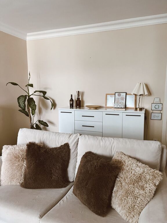
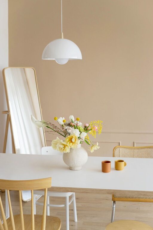
Cream, sand, oatmeal, taupe, and light beige create a comfortable foundation. Warm neutrals are versatile and can be used on walls, furniture, curtains, and rugs. They are especially useful when you want a calm space that still feels inviting.
Soft greys
Light grey can look clean and modern without being too stark. Choose a grey with warm undertones if your room has wood floors or warm furnishings. A cooler grey may suit a space with white trim, silver details, or plenty of natural light.
Muted earth tones
Clay, mushroom, soft terracotta, and dusty brown add warmth without overwhelming a room. Use these shades as wall colours, accent pieces, or textiles. They can make large or open spaces feel more grounded.
Pay Attention to Undertones
An undertone is the subtle colour beneath the main shade. Two colours that appear beige, grey, or white may look very different because of their undertones.
For example, a beige with yellow undertones may feel warm and sunny, while a beige with pink or grey undertones may look softer and more refined. A white with blue undertones can appear crisp, while a creamy white may feel more relaxed.
To identify undertones, compare several samples beside one another. A colour can look neutral on its own but reveal its undertone when placed beside another shade.
Also consider the fixed features in the room, including:
– Flooring
– Countertops
– Cabinets
– Stonework
– Wood trim
– Large pieces of furniture
Try to choose colours that complement these features instead of competing with them.
Test Colours in Your Space
Colour samples are essential because paint and fabric can look different in a shop, on a screen, or in a sample book. Lighting, room size, and nearby surfaces all affect how a colour appears.
Paint a sample on more than one wall, especially if the room receives light from different directions. Observe it in the morning, afternoon, and evening. If possible, leave the sample in place for at least a day or two.
You can also use large sample boards. This allows you to move the colour around the room and compare it with furniture, flooring, and artwork.
When testing a colour, ask:
– Does it look too bright or too dull?
– Does it feel warm or cool?
– Does it work with the flooring?
– Does it look pleasant in both natural and artificial light?
– Does it support the mood you want?
Consider Natural and Artificial Light
Light has a major effect on colour. Rooms with northern exposure may receive cooler, softer light, which can make blue and grey shades appear more pronounced. Southern exposure often provides warmer light, which may make colours look brighter or more golden.
East-facing rooms tend to have warm morning light and softer light later in the day. West-facing rooms often receive stronger, warmer light in the afternoon and evening.
The type of light bulbs you use also matters. Warm bulbs can make cool colours look more balanced, while cooler bulbs may make warm colours appear less yellow. Test colours under the lighting you normally use rather than relying only on daylight.
If a room is dark, a light warm neutral may help it feel more comfortable. If a room receives strong sunlight, a muted or slightly deeper shade may prevent it from feeling too bright.
Build a Simple Colour Palette
A calm home usually benefits from a limited colour palette. Instead of selecting a different strong colour for every room, choose a few related shades that create continuity.
A simple palette might include:
– One main wall colour
– One or two supporting neutrals
– A darker shade for contrast
– One gentle accent colour
– Natural tones from wood, stone, plants, or woven materials
For example, you could combine warm white walls with pale sage accents, light oak furniture, and soft charcoal details. The colours do not need to match exactly. They simply need to feel connected.
Repeat colours throughout the home using cushions, rugs, artwork, curtains, and small decorative items. Repetition helps the overall design feel intentional without making every room look identical.
Balance Cool and Warm Tones
Using only cool colours can make a space feel distant, especially if it has limited sunlight. Using only warm colours may make it feel heavy or overly cosy.
Balance is often the best approach. Pair a cool wall colour with warm wood, cream textiles, or natural fibres. Alternatively, soften a warm wall colour with white, pale grey, or blue-green accessories.
A room can also feel balanced through texture. Materials such as linen, wool, rattan, timber, and ceramics add visual interest while keeping the colour scheme gentle.
Use Stronger Colours as Accents
Calm rooms can still include colour. The difference is often in how much of the stronger shade you use.
If you love navy, forest green, terracotta, or deep plum, consider using it in smaller areas such as:
– Cushions
– Artwork
– A feature chair
– A rug
– Lampshades
– Books and accessories
– A small section of cabinetry
This approach allows you to enjoy richer colours without letting them dominate the room. You can also change accent pieces more easily if your preferences shift.
Avoid Choosing Colours in Isolation
A wall colour rarely stands alone. Its appearance is influenced by furniture, flooring, window coverings, artwork, and nearby rooms. Gather samples of these elements before making a final choice.
Place paint, fabric, and flooring samples together and view them in the actual room. Look for a comfortable relationship rather than an exact match. Slight variation usually makes a space feel more natural and layered.
Most importantly, choose colours that you enjoy seeing every day. Calm design is not about following a strict formula. It is about creating a home that feels comfortable, balanced, and suited to your routines. By testing samples, considering light, and building a thoughtful palette, you can create peaceful rooms with lasting appeal.